The Psychology of Color in Design
The Psychology of Color in Design
The psychology of color in design is a fascinating topic that has been studied for decades. Colors have the power to evoke emotions, influence behavior, and even impact our physiological responses. As a designer, understanding the psychology of color is crucial to creating effective designs that resonate with your target audience. But what exactly is the psychology of color, and how can you harness its power to elevate your brand?
The psychology of color is a complex and multifaceted field that draws on insights from psychology, neuroscience, and design. At its core, it's about understanding how colors affect human emotions and behavior. As the renowned designer, Josef Albers, once said, Color is a means of exerting a direct influence on the soul. Color is the keyboard, the eyes are the hammer, the soul is the piano with many strings. The artist is the hand that plays, touching one key or another, to cause vibrations in the soul. This quote highlights the profound impact that colors can have on our emotional and psychological states.
The Emotional Spectrum
The emotional spectrum of colors is a critical aspect of the psychology of color. Different colors are associated with different emotions, and understanding these associations is essential for creating effective designs. For example, red is often associated with energy, passion, and excitement, while blue is associated with calmness, trust, and stability. Green, on the other hand, is associated with nature, growth, and harmony. As the color psychologist, Faber Birren, noted, Colors can affect our moods, our attitudes, and our actions. They can make us feel happy or sad, energetic or lethargic, and they can even influence our perceptions of the world around us. By understanding the emotional spectrum of colors, designers can create designs that evoke the desired emotional response from their audience.
Color Harmony and Contrast
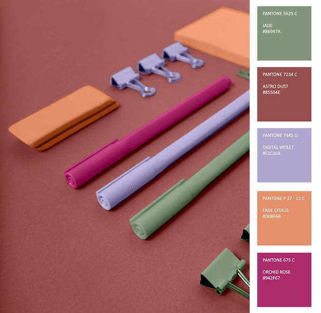
Color harmony and contrast are also essential aspects of the psychology of color. Color harmony refers to the way colors work together to create a visually appealing effect, while contrast refers to the way colors interact with each other to create visual interest. There are several principles of color harmony, including analogous, complementary, and triadic color schemes. Analogous color schemes use colors that are next to each other on the color wheel, while complementary color schemes use colors that are opposite each other on the color wheel. Triadic color schemes use colors that are equally spaced from each other on the color wheel. For example, if you're designing a website for a fitness brand, you might use a color scheme that includes shades of orange, yellow, and green, which are all analogous colors that evoke feelings of energy and vitality.
When it comes to creating contrast, designers often use a combination of colors that are different in terms of hue, saturation, and value. For instance, if you're designing a logo for a tech company, you might use a bold, bright color like blue or green, and pair it with a neutral color like white or gray. This creates contrast and makes the logo stand out. Some key considerations for creating contrast include:
- Using colors that are different in terms of hue, saturation, and value
- Experimenting with different color combinations to find the right balance of contrast and harmony
- Considering the emotional and psychological impact of different colors on your audience
- Using contrast to create visual interest and draw attention to specific elements of your design
Brand Identity and Color Consistency
Brand identity and color consistency are also critical aspects of the psychology of color. A brand's color palette is often one of the first things that customers notice, and it can have a significant impact on how they perceive the brand. As the branding expert, David Airey, noted, A brand's color palette is a key element of its visual identity, and it can play a major role in shaping customer perceptions and emotions. Consistency is key when it comes to brand identity, and this includes consistency in color usage. A brand that uses a consistent color palette across all its marketing materials and touchpoints is more likely to build recognition and loyalty with its customers.
Cultural and Contextual Considerations
Cultural and contextual considerations are also essential when it comes to the psychology of color. Colors can have different meanings in different cultures, and what may be considered a positive color in one culture may be considered negative in another. For example, while white is often associated with purity and innocence in Western cultures, it's associated with mourning in many Asian cultures. As the cultural anthropologist, Edward Hall, noted, Colors are not just a matter of personal preference, but are also deeply rooted in cultural and historical contexts. By understanding these cultural and contextual considerations, designers can create designs that are sensitive to the needs and preferences of their target audience.
Gaming and Color Psychology
The psychology of color in design has far-reaching implications that extend beyond the realm of branding and marketing. Interestingly, the same principles that guide color choices in design also apply to the world of gaming, where colors can greatly impact player experience and engagement. As designers, understanding how colors influence human emotions and behavior can help create more immersive and engaging games. For instance, a game that incorporates a bold and bright color scheme, such as one found at Big Cat King Megaways slot (Blueprint Gaming), can create a sense of energy and excitement, drawing players in and keeping them engaged. By leveraging the psychology of color, game designers can craft experiences that are both visually stunning and emotionally resonant, ultimately leading to a more captivating and memorable experience for players.
Design Trends and Future Directions
Finally, let's take a look at some of the current design trends and future directions in the psychology of color. One of the biggest trends right now is the use of bold and bright colors, which are often used to create a sense of energy and excitement. Another trend is the use of sustainable and eco-friendly color palettes, which are often used to convey a sense of environmental responsibility and social consciousness. As the design expert, Jessica Helfand, noted, The psychology of color is not just about aesthetics, but also about ethics and social responsibility. By understanding these trends and future directions, designers can create designs that are not only visually appealing but also socially and environmentally responsible.
In conclusion, the psychology of color in design is a complex and multifaceted field that has the power to evoke emotions, influence behavior, and even impact our physiological responses. By understanding the emotional spectrum of colors, color harmony and contrast, brand identity and color consistency, cultural and contextual considerations, and design trends and future directions, designers can create effective designs that resonate with their target audience and elevate their brand. Whether you're a seasoned designer or just starting out, the psychology of color is an essential tool to have in your toolkit, and one that can help you create designs that are truly unforgettable. So, what's the psychology of color in design, and how can you harness its power to elevate your brand? The answer lies in understanding the complex and multifaceted ways in which colors affect human emotions and behavior, and using this knowledge to create designs that are visually appealing, socially responsible, and emotionally resonant.